

As we add more content and build more toward our mission for a community of happiness. It becomes important to be recognized and make sure that people can match to a name (brand) the meaning of what we oust to accomplish and therefore bound to.
We are not marketers by trade and definitely not social media experts either. We're social animals therefore we have some natural drive in doing a decent job when communicating but we have a lot to learn still to convey through digital means. In an effective and sustainable way.
We have been working on creating a logo that can be used in our communications and social outlets.
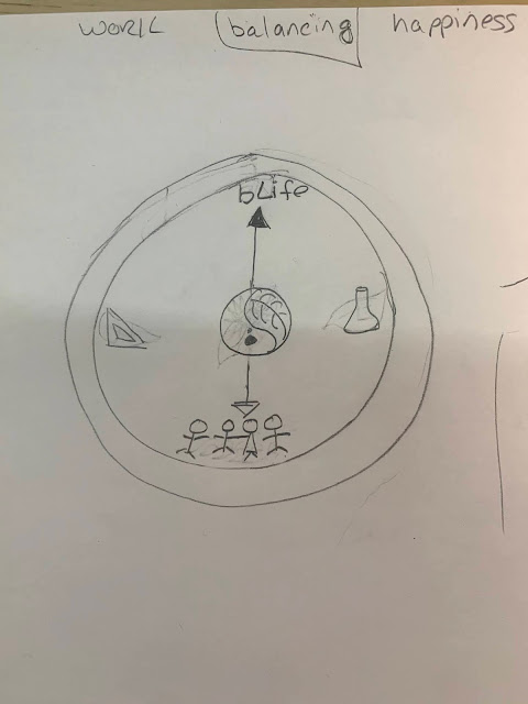
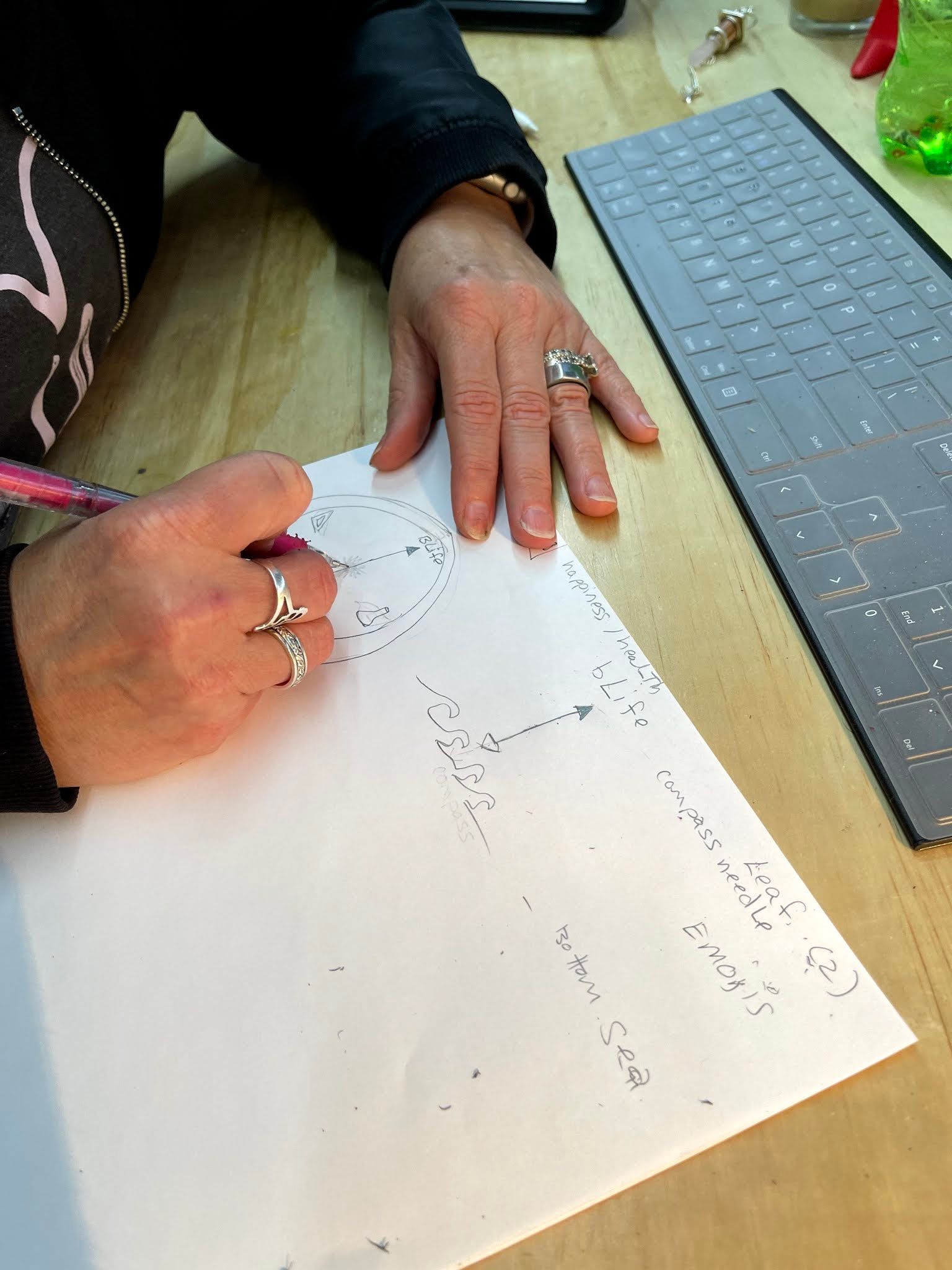
In our first brainstorming of what we wanted to create we immediately felt the call for a compass as the focus of the logo. The rationale is that it's a tool that has saved many that were lost (metaphorically or physically) and has allowed to connect people across the world, via navigation. We are children of the Internet and the Netscape Browser logo comes to mind when it comes to the Internet and indeed it was shaped in a compass frame.

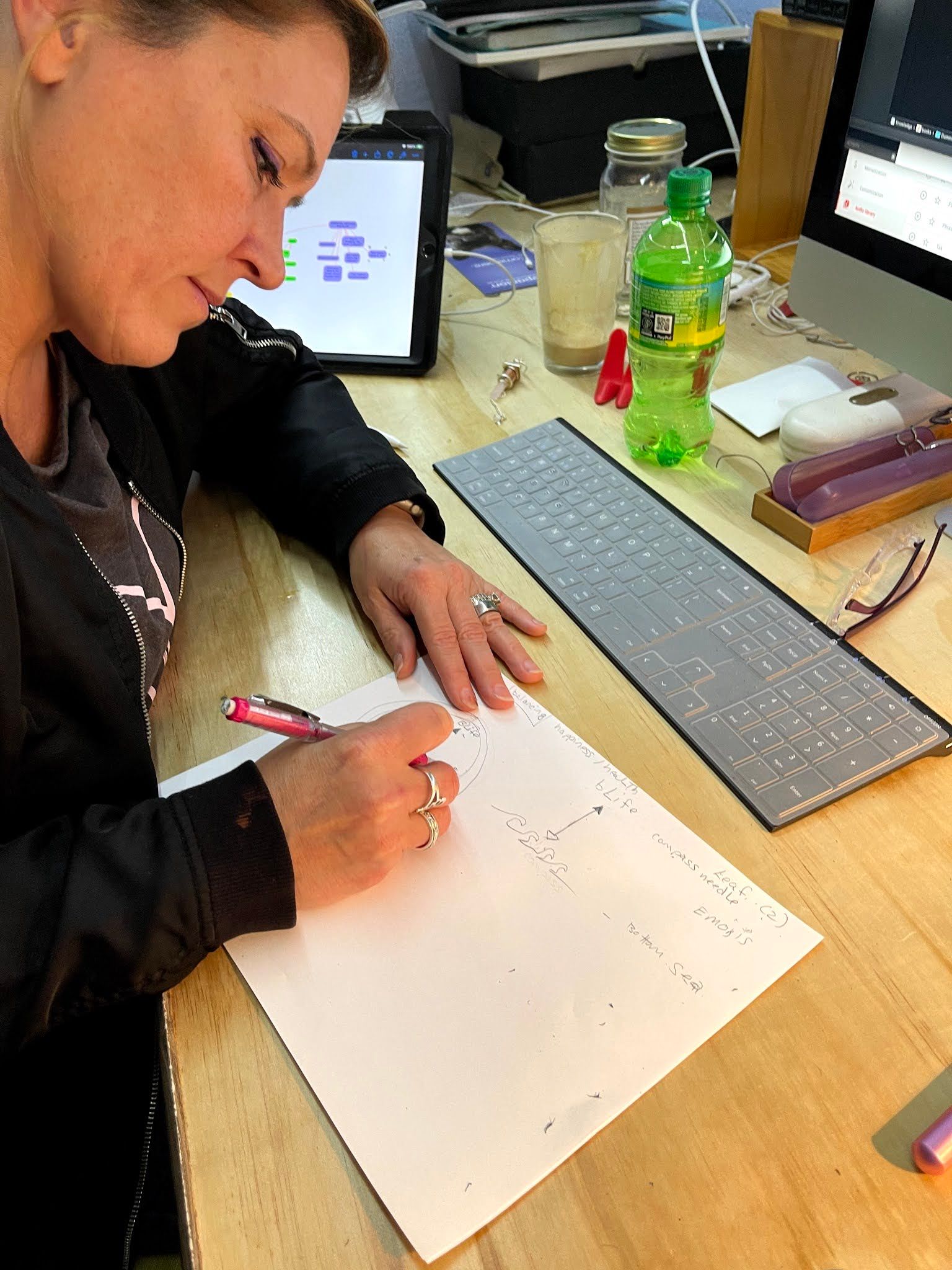
We sat together an evening by Victoria's crafting desk and start sketching and brainstorming about what do we stand for with our movement. "Lead by example" became immediately the leading thought among the other principles. And after going through a series of symbols that reflect that concept we landed on the compass.
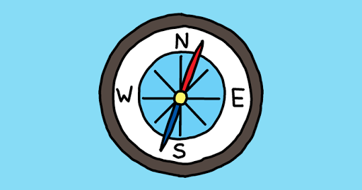
To add some uniqueness, on the matter of where the needle was pointing, we wanted it to reflect "some imperfection" because the best way to build perfection is to never stop improving. Which in this analogy would be the absolute North. And therefore we settled on having the needle slightly away from the North but not too much.
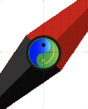
At the center of every "movement" in life, as in motion, there's always a trade-off of forces. Not necessarily good/evil but more about a too-short blanket. If you pull too much you cover the head and uncover the feet as consequence. To reflect that sentiment we landed on the Ying-Yang symbology. We didn't think that positive/negative was the balance we were striving for because the movement idealism is not the blanket analogy but more of an ecological balance.
As an example, watering a garden is critical for the life of plants, watering too much would kill most plants and it would also be a waste of precious resources. Watering less would waste a precious element and kill the plant. So on that line of thoughts, we ended up creating a Ying-Yang of mother nature. Where blue is water (plants) and the sea (fish) and green the plants (produce) and clean air (essential). So we landed on this.
What brought humanity to what is capable of today, is mostly ingenuity and the ability to build new things while leveraging natural resources. As the founders of the movement, we also wanted to reflect the union of the skillset between Mario and Victoria. Where Mario's powerhouse of creativity and knowledge blends with Victoria's strengths of making and perseverance in the pursuit of a shared goal.
We landed on the "speed square" and the lab flask to symbolize science (flask) and the art of making (square) that are equally important but orthogonal to one another when it comes to the practicality of making it happen.

In the first iteration, we wanted the term bLife to be where the needle was pointing to. Aiming to the reach of nirvana. And clearly, we wanted that nirvana to be the bLife term. As we kept iterating we realized that the logo was getting busy with all these inner meanings and we decided to replace the word with the symbol that more represents the essence of life and therefore of the bLife Movement: The "sun".
In making that change we also revisited the material of the crown of the compass. We went from metal to wood with a visible glass effect. That would allow for 3D animation in weblogs and other interactive material. The principle we were aiming for, was clearly the balance between modern and retro. And since we're on an island it had to have a bit of pirate-like as in Jack Sparrow from Caribbean effect.
At that point, since we had taken out the wording we needed at the bottom of the logo the name of the movement. We tried a variety of fonts but everything we had tried felt "too perfect". Instead, we believe that "imperfections" of all of us as part of the movement, give more uniqueness and value to what we stand for. Finally, we found the balance of rigor and imperfection using this font.

Those unfinished connections spoke to us and at the same time, it gives a bit of sci-fi look that is by far the genre that we enjoy the most when watching movies or Elon Musk throwing stuff in the sky.
At this point, we were pretty content with the logic that was leading to the composition of the logo. We kept sketching and brainstorming for hours.
As we kept going through this work, I start appreciating my friends and colleagues that do marketing for a living, because this type of creative work can progressively grow in scope and complexity. AKA, out of control, and when you have lots of people working on it, the timeline just becomes a horde of ogres aiming for the one apple on a tree.
We realized that we will want to use the logo on socials and our vlog channel and from our little experience with YouTube a simple image laying there on the screen for a few seconds isn't the most appealing thing to do when competing for eyeballs.
So we concluded we needed some background audio, we started brainstorming about voice-over of us; then general slush sounds to break the silence, and as the logo was fading in. After so much testing we landed on a jingle.
After hours of reviewing several freelancer musician's works, we found a couple on Fiverr that nailed what we were looking for. We booked the artists and after a few exchanges, we received the jingle. It was a hit on the first play.
Finding someone to assemble the logo became quickly a much harder job as the quality of what we have received so far is very amateurish, even going pretty high in the price tier the outcome still not great. I will update the post as we make progress. At this point we have gone through a large amount of literature about marketing and have had experience in working with remote talents, we're confident that we will get there. And as for logos of major companies, logos evolve with time and we too.
While I write this, my Amo (Victoria) just landed in Molokai and now my focus is on checking in with her and figure out something for dinner.
A local, Robert, an absolute sweetheart of a person that we met during our research visit in Molokai, showed up to pick her up with all her super heavy luggage and bring her to our bLife HQ.
My dinner will be a boring, almost non-miserable, salad. My goal will be to make it less boring and slyful for the mind. So that once I am done eating, my brain is convinced that was worth the effort and that courage...
As I mentioned in a previous post, I consider it to be an offense to the island showing up my next time in the same or worse shape than when I discovered it. So I am shaving lard as much as I am capable. Before going there and definitely keeping it up once there.
Moloka'i is also known as the "enlightening" island as it totally breathes the Aloha spirit. For us, that was the kick to move there and that was before we even knew about this piece of a notion from Dali lama representatives.
Molokai, “The Enlightening Isle,” embodies true Hawaiian culture and Mother Nature’s beauty. However, it has a dark history… it was previously used to isolate those with leprosy. Fast forward to today, people ironically seek this island to isolate themselves from the rest of the world. It’s now redeemed as a tranquil “home away from home” for those who seek to meditate and enjoy its true beauty. From having the world’s highest sea cliffs, isolated trails, and one of the whitest sand beaches, it’s definitely a must-see. Centuries before that name, when the island was feeding the other islands due to the prosperity of the land throughout its 39 miles, it was called Molokaʻi ʻĀina Momona (land of abundance). Therefore, before I step on the island next time, I gotta be more ready than the first time to drink the islander kool-aid in full. Hence, I am working on both topics to fit in.
In the meanwhile... Have a bLife.


